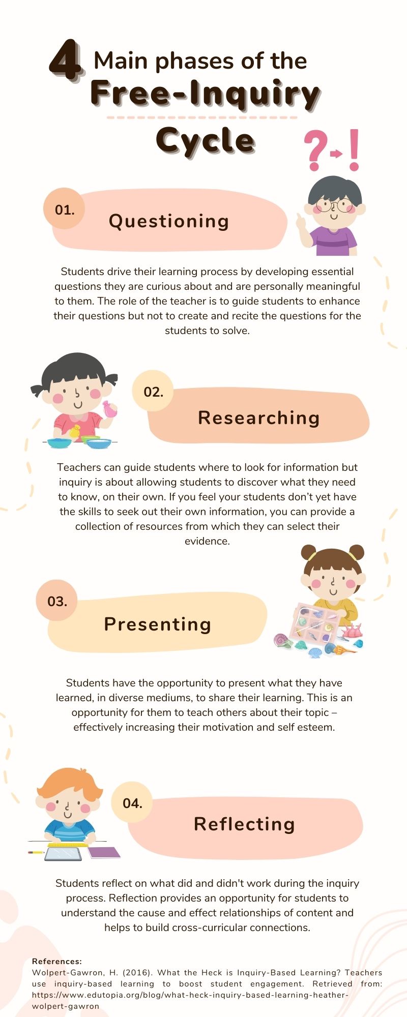
Effective infographics are well designed, entertaining, and follow a ‘story’ as your viewer moves their eyes through the text (Visme, 2017). Infographics are created to share information quickly and clearly and are so effective because they utilize Mayer’s multimedia principle – pairing words with images for deeper learning and retrieval. This week, I created an infographic using Canva about the 4 main phases of the free-inquiry cycle and had my hand at utilizing some design principles and elements of design to help me get my message across.
The infographic I created

Design principles I utilized
- Alignment: Alignment helps to ensure a design looks sharp, aesthetically pleasing, and connected (Adobe, 2020). In my design, I focused mostly on center alignment for my main bodies of text and left/right alignment for my margins. I also attempted symmetry with my images but struggled to make them the exact same size, which made it difficult to align them perfectly. I do however appreciate that Canva has rulers and guides, which make it easier to align your objects. I also recently learned that you can align multiple objects in Canva by highlighting all of them, and then choosing “align elements.”
- Hierarchy: Hierarchy is giving extra weight to the most important messages of your infographic (2020). In my design, I used hierarchy with large/bold fonts for the title and the 4 main headers. With a quick glance, it is obvious what areas I want you to focus on the most.
- Repetition: Repetition can include repeating colors, fonts, words or shapes that help with the aesthetics of your design (2020). There is repetition throughout my design, but I feel repetition is mostly unavoidable with the templates Canva provides – which is really useful for novice designers, like myself.
- Proximity: Proximity is grouping similar or related elements to support comprehension (2020). I made sure to place my numbers, information, and image of each phase of the inquiry cycle – close together – so it was clear to the reader, which went with which.
- Negative Space: Negative space is utilizing the space without images or text to balance and compliment your design (2020). I specifically chose this template for my infographic because of its use of negative space. When designs are too crowded and cluttered my eyes feel overwhelmed and it contributes to my cognitive overload.
Full disclosure: I have used Canva a handful of times throughout my program. I love the templates, easy interface, and usability of the program so I just couldn’t turn down another opportunity to create a new design with their platform. I will however, make sure to check out the other programs Visme and easel.ly that were offered in the future. I am more eager than ever to create multimedia now that I have a better understanding of design principles and how to utilize them to enhance my messages and designs.
I also feel I need to add this link for future reference on the Top 10 world’s worst PowerPoint presentations because it is good for a chuckle. We have all been there!
References:
Adobe (2020). 8 basic design principles to help you make awesome graphics. Adobe Express. Retrieved from: https://www.adobe.com/express/learn/blog/8-basic-design-principles-to-help-you-create-better-graphics
Visme (2017). How to Create an Infographic – Part 1: What makes a good infographic? Retrieved from: https://www.youtube.com/watch?v=nLxQAa5Sras

Hi Sarah,
First off, I loved you infographic! It can be matched with the templates that are on Canva. The negative space that exists in the infographic draws my attention immediately to the aligned texts. With the use of hierarchy I am able to read the topic before reading the smaller text to gain a better understanding. Repetition was beautifully with the four cute pictures to brighten the whole infographic. I loved the peach-skin coloured palettes used for the
numbering and background for the topics! The only thing I could give as criticism due to my lack of experience with design and Canva would be to suggest that maybe for the text portion you could have it left-aligned to make it look even more appealing.
The cherry on top for me was when under the infographic you explained 5 of the 8 design principles while explaining how you incorporated them in the design. It is like an artist explaining their artwork!
I am very excited to see your future work on Visme and easel.ly which demonstrates your ability to leave your comfort zone in Canva and using a completely new platform.