Sarah Hiscox: EDCI 337

Author: MsHiscox (Page 1 of 2)

Personalized Learning and AI Resources

What is Personalized Learning in K-12? (5 min) – An overview of the promise and potential pitfalls of large-scale personalized learning in K-12 classrooms

Six Examples of What Personalized Learning Looks Like (10 min) – Some examples of personalized learning applied to K-12 classrooms

What is AI (5 min) – An introduction to Artificial Intelligence

What is Machine Learning? (2 min) – A brief introduction to machine learning, a branch of AI used to build and update data models

Adaptive Learning in Medicine (3 min) – A case study of an AI platform called Area 9 (developed in Montreal) applied to medical training.

AI Duets (3 min) – An experiment with musical composition and AI

The Far-Reaching Legacy of the First Teaching Machines (15 min) – A look at the history of personalized learning and the potential pitfalls of technological solutions.

Duolingo uses AI to Humanize Language Learning (10 min) – A closer look at how Duolingo has been using massive amounts of user data to build new AI-driven learning activities

AI Tools

Many of you may be familiar with Duolingo, which is profiled in this week’s Read/Watch. Here are some other examples of AI tools, some experimental, that make use of data algorithms:

  • Anki – Creates flashcards and uses spaced repetition to show you the cards you know the least well.
  • Talk to Books (google.com) – This experimental app from Google allows you to ask questions that turn queries into a collection of quotes from books. Also uses voice recognition software to allow dictated queries.
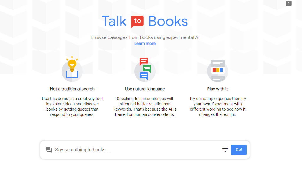
From books.google.com
  • Magic Sketchpad (magic-sketchpad.glitch.me) – An AI experiment from a team at Google that gets a neural network to draw along with you. Every time you let go of a line, the platform will respond to your scribble by finishing the drawing according to a set category. The neural network has been trained on millions of doodles mined from a similar project called Quick, Draw!. Start by picking a category from the drop-down list at the top right of your screen—there is plenty available, from frogs to sandwiches. Magic Sketchpad knows the sorts of shapes and lines that people tend to make when they’re trying to draw simple concepts like a bird, a ship, or a cat, so it can predict what you’ll draw next and finish the doodle for you.
  • AI Duet – Puts a keyboard down at the bottom of your screen and produces an automatically generated response based on what you play on it. You can click the keys on your screen, hit them on your keyboard, or even connect a MIDI keyboard to your computer. A traditional approach to a project like this would have involved a programmer coding in hundreds or even thousands of responses to specific patterns a user might play. But AI Duet comes up with its own responses based on a huge database of tunes it has trained on. This gives the program the ability to generate melodies that match a user’s input without any specific instructions.
  • If you don’t mind getting some marketing email in return, you can sign up to access some of Area 9’s sample adaptive training modules to get a sense of what adaptive learning feels like for the learner.

Interactive Learning with Twine

The UVic Libraries Digital Scholarship Commons (2021) describes Twine as, “an open source tool that can be used to create stories that are interactive and non-linear.” Essentially it is a free platform in which you can create branched scenarios, choose your own adventure stories, and complex games. Twine stories are saved locally on the readers web browser, without a need to create an account, so there are little to no privacy issues – which is great news for introducing Twine to young students (2021).

This week, I created an interactive story with Twine titled, “Building a pizza with fractions.” I made this game to include in my final multimedia design project that a colleague and I are creating to assist in teaching fractions to young students. Below I will share my Twine story and the elements and learning involved in it’s interactivity.


My Twine Creation – A Fractions Pizza Game!

Game elements used

  • Narrative – There is a story behind my game with the customer (the player) creating a pizza at a pizzeria.
  • Immediate Feedback – With each selection (this or that) the player receives immediate feedback depending on their answer
  • Player Control – The player has complete control over the outcome of the game
  • Mastery – As the player progresses through the questions, they gain mastery over simple fractions skills.

Learning involved

Twine is an effective learning tool because it is fun, engaging, and it’s design helps to reduce essential overload for students by segmenting the material (one question per page). Twine also builds on students skills and knowledge as they progress through the interactions which will increase their motivation to play/learn.

As creators of Twine interactions, students would be introduced to basic coding, logic (if/then), and simple bits of html. I would not recommend Twine for primary students but I could see it being an incredible tool to strengthen computational thinking for intermediate-middle aged students. I could see students having a lot of fun with Twine and will definitely be using it again in the future!


Twine resources from our course site:

How to Use Twine (7 min) – An introduction to Twine including an example of using the platform for game design.

Let’s Play – Twine – A guide to gamification using Twine (from Thompson Rivers University)

Introduction | Interactive, Nonlinear Stories & Guided Interviews with Twine (uviclibraries.github.io) – Instructions from the UVic Library for using Twine for learning.

Twine Cookbook (twinery.org) – A comprehensive guide to using Twine from twinery.org.

W3Schools Online Web Tutorials – If you want to explore using some HTML or CSS in your Twine story this will give you the info you need to make it work.


Some neat augmented and virtual reality examples shared this week that I want to add:

Virtual Field Trips w/Google Expeditions

1943 Berlin Blitz Immersive Experience in 360

Virtual Reality Simulations for Public Speaking w/Virtual Speech

Core Multimedia Assignment

Mayer’s multimedia learning principles have taught me how to make increasingly effective and engaging online learning materials for diverse learning needs.  The principles, and aligning theories, provide a set of guidelines to decrease students cognitive load and increase their motivation to learn. Below, I offer a previously created media object from earlier in the term -a screencast tutorial on Google Jamboard – and re-evaluate the video as I integrate new components that adhere to multimedia theory, to assist in learners knowledge integration and retention.


My original screencast tutorial:

Edit – *There are 4 main stages to the water cycle*


What went right with my first tutorial?

My original tutorial:

  • aligns with dual coding theory – it requires simultaneous use of both visual and audio-processing channels, which increases retention for my viewers
  • aligns with Mayer’s segmenting principle – viewers are able to control the pace of the tutorial – they can pause and rewind as required, which will assist in managing their intrinsic load and integrating new information into their working memory

My updated screencast tutorial:


What did I change, and why?

With the help of YouTube studio, I was able to make the following additions:

  • Video description:
    • Adding descriptions to my tutorial follows the pre-training and signaling principle by providing an overview and highlighting the key information and its organization. With the added description, learners won’t have to use cognitive resources to find essential material or to discern what’s most important about the video. Not only did I add a brief overview of what the video was about, but I also added timestamps to inform what was being taught at certain points throughout the video. I also included a call for viewer comments to clarify misunderstandings or questions they may have and a link to my WordPress blog on screencasting for further information.
  • Captioning:
    • This was my first experience with adding captioning to a video and was impressed with the auto captioning feature on YouTube, although I did have to go back in manually to clean up minor errors. This process sure made me realize that I say ‘so’ a lot in my tutorial! I am glad I now have experience with adding captioning to my media objects and will continue to utilize this feature to ensure an accessible experience for all of my viewers/students.

What I chose NOT to upgrade and why:

    • Embed headers, key words, etc. :
      • The redundancy principle states that humans learn best with narration and graphics, not narration, graphics AND text. For this reason, I chose not to embed headers and key words to not distract or overwhelm the viewer.
    • Add music:
      • I considered adding music but that would have been extraneous and distracting – which does not align with the coherence principle.
    • The video narration:
      • I made many errors in the form of “umm’s” and “so’s” so I considered re-voicing my entire tutorial but I decided that I like the personalization and  conversational language from the original.

Mayer’s Principles retrieved from: https://ctl.wiley.com/principles-of-multimedia-learning/ 

Interactive Learning with H5P

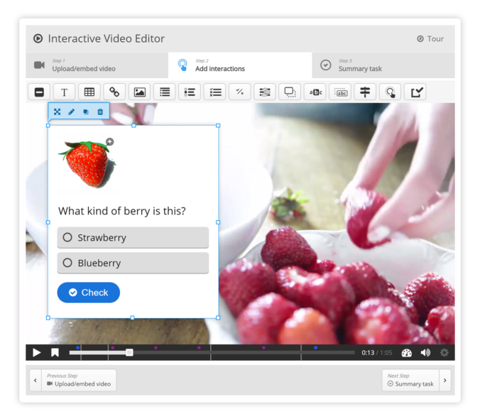
As a future elementary educator, I am always looking for new ways to make my lessons more interactive and engaging. This weeks tutorial on H5P has given me the tools to do just that! Below, I will share what H5P is, how it can be used in an educational setting, and also share some of my experiences with the useful interactive learning tool.


What is H5P?

H5P is a free, “open source authoring tool integrated with WordPress and many other platforms that allows you to quickly create, share and reuse a wide variety of interactive and engaging learning activities” (Watt, 2022).

Here are some of the pre-built activities and interactive content offered on H5P that can be embedded into videos, slideshows, presentations, blogs etc.

  • drag and drop
  • image hotspots
  • multiple-choice
  • fill in the blanks
  • accordion
  • flashcards
  • memory games
  • columns
  • question sets
  • dialogue cards
  • branching scenarios
  • and more!

H5P resources to assist in creating content:

H5P tutorials

Catalogue of H5P content

Discover – Learnful

H5P OER HUB


My first experience with H5P

I am shocked that I had previously never heard of H5P. I have seen interactive components integrated into media before, but did not know what tool was being used for their creation.  I found H5P very user friendly and following the provided H5P tutorial made the creation of my own interactive resource so simple.

After entering my multiple choice information, I made an error by not saving my creation before trying to embed it into this post, so I had to recreate it, but that provided me with more opportunities to play with the tool. Also, because it was my first time, I was unclear as to what the finished product would look like until I updated my post, but I was happy with the result in the end. In the future, I would also change my settings on YouTube to prevent pop-ups from occurring during the videos.

Here is my first go at H5P:


Which H5P tools will be the most useful for me?

In an elementary setting, I believe that most (if not all) of the H5P tools will prove useful. They provide an excellent opportunity for formative assessment as they give students a chance to practice critical skills with immediate feedback. Below are a few of my favorites so far and examples of how I would use them in the classroom.

  • Drag and drop & dialogue cards – great way to solidify knowledge of terminology and new concepts
  • Multiple choice – like my example above, this tool is great for measuring students understanding before, during, and after a lesson
  • Question sets – useful for ice-breaker activities like ‘This or That’

Of these examples, I think the drag and drop and dialogue cards would require the most resources to create because you would need to pre-make sentences to be filled in, or terminology to review. This is a very small barrier for creation though because the benefits FAR outweigh the effort or resources required to create meaningful interactive components.


Bonus H5P creation

I just had to try another one of H5P’s tools. Below I explore using alternative options with a simple read-aloud on an Autumn Story For Kids: Leaves!


Resources:

Watt (2022). W-9: Active and Passive Learning. Retrieved from: https://edtechuvic.ca/edci337/2022/10/29/w9-active-and-passive-learning/ 

Show. Don’t Tell. – And other storytelling techniques

In the reading provided this week, 7 Storytelling Techniques Used by the Most Inspiring TED Presenters, I found Dananjaya Hettiarachchi’s  winning speech, “I See Something” (2014), the most compelling. I was immediately drawn to his story because he masterfully uses numerous effective story telling techniques – and it is hilarious!


Hettiarachchi’s – “I See Something”


Storytelling techniques he uses:

  • Immerse your audience in a story: He effectively immerses his audience by using animated movements, audience participation and humor
  • Tell a personal story: He shares intimate details of his life and although they are personal, they are relatable to the viewer
  • Create suspense: When he starts plucking the petals off of the rose, the viewer is compelled to learn more
  • Bring characters to life: When he talks about the characters of the story, like his mom and dad –  it is like you can see and hear them
  • Show, don’t tell: His use of the rose losing its’ petals as a metaphor for being broken sends a powerful, visual message
  • End with a positive takeaway: His story reminds us to be grateful for the people in our lives who support and understand us, when we are feeling lost

Practicing My Storytelling Techniques

This week, I had a turn implementing storytelling techniques to tell a story with a learning purpose. The topic I chose was 3 Strategies to Support Students with Dyslexia. Next week we will be fine-tuning and recording the video, so be sure to check out my finished product on my next blog. I was not able to link my story script (kept getting a 404 error) so below is my created story board, which includes my story script.

My Story Board

These guidelines for creating educational video will help you apply the principles we’ve been exploring to your own videos.

Guidelines Principles
1. Keep it Short
Research has shown that learners are most likely to retain the content of a video if it is less than 5 minutes in length. Shorter videos also allow users to choose the topic or subtopic they want to focus on, rather than searching through a lot of unrelated video to find what they need.
Mayer’s Segmenting Principle
2. Focus on Learning Outcomes
Make sure that your videos are focused and relevant to the course.
Mayer’s Coherence Principle
3. Use a Conversational Tone
When you narrate your video, use a friendly, enthusiastic, conversational tone.
Mayer’s Personalization Principle
4. Include Active Learning
Engage the learner in active learning by posing questions and asking them to solve problems or consider alternatives.
Merrill’s First Principles (Problem -centred, Application)
5. Add Visual Elements
To emphasize key points in your video, add visual elements like diagrams, text call outs and short clips from other sources.
Mayer’s Signalling principle
6. Keep Text and Images Together
Present images and text next to each other on screen rather than one at a time.
Mayer’s Spatial and Temporal Contiguity principles
7. Build in Accessibility
Ensure that you include captions, transcripts and descriptive audio wherever possible.
UDL Guidelines

Evaluating and Creating Media Resources from last week:

Choosing media (10 min) – A presentation by Tony Bates on the model he created for evaluating media for learning.

What is the TPACK Model? (6 min) – An introduction to the TPACK model and its seven components.

Filming and Editing Video – A tutorial to guide you through the process of filming and editing video.


Resources

Video Editing with iMovie and Microsoft Video Editor – A self-paced workshop from the UVic Library with instructions for using iMovie (Mac) and Microsoft Video Editor for editing.

How to Edit Video with Openshot – Step by step instructions for editing using Openshot.

How to Edit Video with Shotcut – A beginner’s guide to using Shotcut for video editing.

Finding Images and Attribution – A tutorial to assist you finding images that are not copyrighted.

Using Constructive Alignment and Instructional Principles to Guide a Lesson

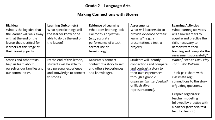
Creating effective, engaging, and meaningful lessons for learners can be a challenge. This week we learned about principles and practices of instructional design such as constructive alignment and backwards design, that will support us in creating learning opportunities that go beyond rote memorization and ‘busy’ work for our learners. Below, I created a grade 2 ELA lesson on using stories to connect with ourselves and others – using the constructive alignment template provided. I wanted to take this one step further and utilize Merill’s five principles of instructional design  to the same lesson to see how I could strengthen the lesson content to engage my learners to solve authentic problems (2002).


Example of Constructive Alignment:

Big Idea Learning Outcome Evidence of Learning Assessment Learning Activities
Aligned and coherent learning design promotes constructivist learning By the end of this week you will be able to: Recognize misalignment in outcomes, assessment and activities in a lesson design An accurate example of alignment or misalignment in a lesson design -A blog post demonstrating use of a planning template and reflecting on process-A comment on another post -Watch video demonstration of alignment and misalignment and discuss with Learning Pod-Practice using a planning template

My ELA lesson

Grade 2 ELA lesson on using stories to connect to self and others created using constructive alignment

Big Idea and learning outcomes retrieved from BC Curriculum – Grade 2 ELA


Merrill’s Five Principles applied to this lesson:

  • Learners are engaged in solving real-world problems 
    • The real-world problem in this case is ‘how to make our classroom more inclusive’ or more specifically, ‘how to make x activity more inclusive in our classroom’. 
    • Start lesson by providing an overview of what we will be learning.
  • Existing knowledge is activated as a foundation for new knowledge
    • Prior knowledge activation. Class discussion/writing ideas on the board –what does it mean to be included/left out? 
    • Followed by watching a read aloud of Can I Play Too? by Mo Willems.
  • New knowledge is demonstrated to the learner
    • Watch this video on Ways to Teach Kids about Inclusion
    • Model how to complete a simple graphic organizer
    • focus on identifying and implementing specific things that you can do in your classroom to make it more inclusive (e.g., removing a physical barrier such as books that are too high for smaller students to reach or allowing more time for transitioning to new activities, or rotating partners rather than having people choose etc.). They need to learn the emotional intelligence piece but also how structural changes can support those behaviours.
  • New knowledge is applied by the learner
    • Play a game- provide scenarios  of good and bad  problem-solving, fairness, and relationship skills in a classroom setting and have students raise their hands according to whether they believe it was a good or a bad way to include others/be fair.
    • Think-pair-share – have you ever been left out or seen someone left out? how did that feel? what could be done to help everyone feel included?
  • New knowledge is integrated into the learner’s world
    • Creation of graphic organizer  (“Story reminds me of/makes me think of?”)

How did I feel about using Merrill’s principles to guide my lesson?

Honestly, I struggled with this and see many inconsistencies with this lesson. I understand the effectiveness of utilizing design principles to guide lesson creation but I found it difficult to implement with young learners, without it feeling like a stretch.  I feel that I need  more experience with this process in order to create effective learning experiences that are engaging, meaningful, and help students apply their knowledge to new situations. 


The look of boredom I hope to prevent during my lessons!

Gif of Bart Simpson looking bored, retrieved from giphy.


Resources:

Merrill, M. D. (2002). First Principles of Instruction. ETR&D, 50, 3. pp. 43-59.

Utilizing Design Principles with Infographics

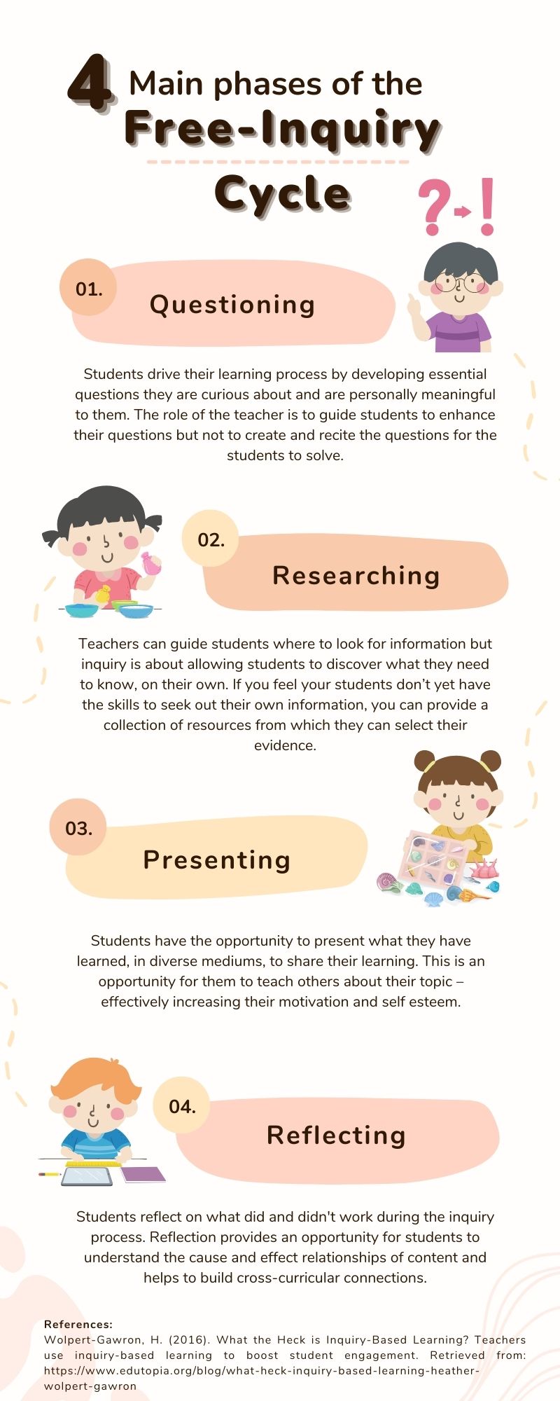
Effective infographics are well designed, entertaining, and follow a ‘story’ as your viewer moves their eyes through the text (Visme, 2017). Infographics are created to share information quickly and clearly and are so effective because they utilize Mayer’s multimedia principle – pairing words with images for deeper learning and retrieval. This week, I created an infographic using Canva about the 4 main phases of the free-inquiry cycle and had my hand at utilizing some design principles and elements of design to help me get my message across.


The infographic I created


Design principles I utilized

  • Alignment: Alignment helps to ensure a design looks sharp, aesthetically pleasing, and connected (Adobe, 2020).  In my design, I focused mostly on center alignment for my main bodies of text and left/right alignment for my margins. I also attempted symmetry with my images but struggled to make them the exact same size, which made it difficult to align them perfectly. I do however appreciate that Canva has rulers and guides, which make it easier to align your objects. I also recently learned that you can align multiple objects in Canva by highlighting all of them, and then choosing “align elements.”
  • Hierarchy: Hierarchy is giving extra weight to the most important messages of your infographic (2020). In my design, I used hierarchy with large/bold fonts for the title and the 4 main headers. With a quick glance, it is obvious what areas I want you to focus on the most.
  • Repetition: Repetition can include repeating colors, fonts, words or shapes that help with the aesthetics of your design (2020). There is repetition throughout my design, but I feel repetition is mostly unavoidable with the templates Canva provides – which is really useful for novice designers, like myself.
  • Proximity: Proximity is grouping similar or related elements to support comprehension (2020). I made sure to place my numbers, information, and image of each phase of the inquiry cycle – close together – so it was clear to the reader, which went with which.
  • Negative Space: Negative space is utilizing the space without images or text to balance and compliment your design (2020). I specifically chose this template for my infographic because of its use of negative space. When designs are too crowded and cluttered my eyes feel overwhelmed and it contributes to my cognitive overload.

Full disclosure: I have used Canva a handful of times throughout my program. I love the templates, easy interface, and usability of the program so I just couldn’t turn down another opportunity to create a new design with their platform. I will however, make sure to check out the other programs Visme and easel.ly that were offered in the future. I am more eager than ever to create multimedia now that I have a better understanding of design principles and how to utilize them to enhance my messages and designs.


I also feel I need to add this link for future reference on the Top 10 world’s worst PowerPoint presentations because it is good for a chuckle. We have all been there!


References:

Adobe (2020). 8 basic design principles to help you make awesome graphics. Adobe Express. Retrieved from: https://www.adobe.com/express/learn/blog/8-basic-design-principles-to-help-you-create-better-graphics 

Visme (2017). How to Create an Infographic – Part 1: What makes a good infographic? Retrieved from: https://www.youtube.com/watch?v=nLxQAa5Sras


Inclusive Design

This week I dug into accessibility and inclusion in education – what it is, who it benefits, and how to achieve it. I also used a web evaluation tool called  WAVE, to determine how inclusive and accessible my last blog post was – and the results were eye-opening. The importance of removing barriers in my media designs to ensure that everyone can have access and equitable learning opportunities it really important to me and after this weeks module I feel more prepared to practice inclusive design.

What is inclusive design?

Every design has the potential to include or exclude people. Inclusive design “aims to provide the best user experience for as many people as possible” (Sehl, 2020).  Shelley Moore, a local BC educator and advocate stresses the importance of always including adaptations and modifications to all learning design as a means to anticipate barriers, prevent exclusion, and increase effectiveness and efficiency of the learning process (2021).

What does it look like and who does it benefit?

When designing for inclusion and accessibility it is important to understand the diverse needs of your students. Adaptive tools, technologies, and strategies that increase engagement and participation for all, include:

  • practical design choices
    • text, headings, font, color choices
  • alternate text for images
  • captioning for videos and descriptions of visual elements
  • transcripts
  • text-to-speech tools (screen readers)
  • implementing user controls (ability to control speed & sequence of material)

These inclusive design choices provide assistance to a wide range of learners. For example, students who:

  • are hard of hearing or deaf /Deaf
  • foreign language learners
  • require extra processing time
  • are in sound sensitive environments
  • struggle to understand accents
  • literally everyone else!

This is the really neat thing about accessibility and inclusive design – it is not just for the ‘outer edge’ learners. These design adaptations help everyone in every learning environment. In my own life, I often rely on text to speech tools when I am busy with another task but still want to progress in my readings. I also use captioning on my T.V. to ensure that I can focus on what is being said, instead of the distracting noises of my environment. And I often require user controls while I am learning, to control the speed and pace of new information to manage my cognitive load.

Have I been effective at inclusive design?

Yes, and no. When I ran the WAVE accessibility report on my previous Sketchnoting post, I noticed that I had implemented a few equitable design choices but I was surprised at the amount of errors I had made. I did not provide alt text for images, my links were inappropriately placed within the text, and my text contrast was unsuitable for viewers experiencing visual impairment. I also realized that my WordPress template itself has a whole array of errors and structural elements that do not follow accessibility guidelines. The Wave report and this weeks information have given me insight into the need for inclusive design and how to implement strategies that ensure every learner can overcome challenges, increase their self-determination and ultimately have agency over their own learning processes.

Side note: I ran the WAVE accessibility report on this post and I only made 1 error. Getting better!

Additional Accessibility Resources:

Making Videos Accessible: DO-IT Video (washington.edu)(10 min) – From the U. of Washington, an introduction to the accessibility features that can be built into online video. 

Creating Accessible Text (7 min) – A demonstration of how to make digital text more accessible to screen readers.

WAVE Chrome, Firefox, and Edge Extensions (webaim.org) – WAVE accessibility checker for the web

Poet Image Description (diagramcenter.org) – How to create effective image descriptions for your alt tags

WCAG – Contrast Checker – Not sure if your text colour is dark enough? Check the contrast here.

Resources:

Moore, S. (2021). Removing the Barriers: Planning for ALL! Retrieved from:  https://www.youtube.com/watch?v=MzL8yMBKM7k

Sehl, K. (2020). Inclusive Design for Social Media: Tips for Creating Accessible Channels. Retrieved from: https://blog.hootsuite.com/inclusive-design-social-media/

Sketchnoting!

My experience with sketchnoting

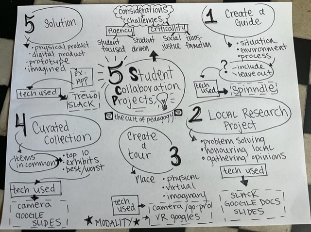
One of my favorite education podcasts is The Cult of Pedagogy with Jennifer Gonzales. I tried my hand at Sketchnoting while listening to her podcast on Five Fantastic Ideas for Collaboration Projects.

While listening to the podcast, I felt less stressed to write down Gonzales’ ideas verbatim. Instead, I found myself focusing on key words, big ideas, and meaningful connections. I am naturally a ‘doodler’ and a visual learner so sketchnoting felt natural to me as a means to visualize and synthesize my podcast learning. I also found I was able to keep the information in my memory longer as I moved from my rough draft, to my final version above.

The difficulty I encountered while sketchnoting was layout. My rough draft was all over the place and I was running out of space. I am not sure how practical it is to re-write/draw every learning that I encounter, but that repetition is what helped me keep the information in mind.

Will sketchnoting help with intrinsic load?

Three of Mayer’s principles that help to minimize essential overload are: segmenting (or chunking), pretraining (overview beforehand), and modality (graphics and narrations vs. text and graphics alone). I do think that sketchnoting is an excellent tool to incorporate segmenting into multimedia design. As I was creating my text boxes and arrows, I was naturally chunking the different bits of information into relative sections. As for pretraining, I appreciated Doug Neill’s video on how to sketchnote without illustrations as it showed me techniques on how to make the best out of my sketchnote. I would also follow the pretraining principle by showing my students Neill’s video(s) beforehand and provide an example on the board. One way to utilize the modality principle with sketchnoting would be to upload my sketch onto Google slides or screencast while verbalizing the learning alongside the graphics. I would want to use more of an illustrative sketch though because mine has way too much text to be effective.

Will I incorporate sketchnoting in my classrooms?

Yes, yes, yes! Sketchnoting is such a great tool to incorporate into lessons and note taking. I love that individuals can be learning the same information but everyone’s sketches will be unique. I can see how this would be effective for diverse learning styles and subjects – as well as to increase motivation, retention, and recall.

Some fans of sketchnoting that I have come across:

Why Teachers Are So Excited About the Power Of Sketchnoting - MindShift

Carrie Baughcum on why sketchnoting is effective for learning. Check out Carrie’s  website for many sketchnoting ideas and projects.


Sketchnotes — Trevor MacKenzie

Created in collaboration by two local, inquiry-based teachers – Rebecca Bathurst-Hunt and Trevor MacKenzie. Rebecca’s site doesn’t seem to be working at the moment but Trevor’s website has many amazing sketch notes for public use.

Utilizing Media Principles While Screencasting

Google Jamboard is pretty neat

This week I created a screencast on Screencastify of a short Google Jamboard tutorial (my YouTube video below). In the tutorial I explain how to use Jamboard in an educational environment for assessment purposes but it is also great tool to enhance collaboration, learning and engagement – in any professional environment.

Mayer’s Principles

While I was creating my screencast, I tried to remain mindful to minimize extraneous overload for my viewers. I achieved this by describing the importance of  Mayer’s Principles of redundancy and signaling. The principle of redundancy requires that we are smart about the media we add  to minimize distractions for our learners. During my tutorial, I touch on this as I add an image that enhances my assessment, rather than distracts from it.

Near the end of the tutorial, I teach my viewers how to utilize the laser point tool on Jamboard as a way to signal, or utilize the signaling principle, to guide  their ‘students’ where to look. This can be a really useful feature when you want to use visual cues to help your viewers/learners process content.

Things to keep in mind

Another principle of media design that I did not touch on in my screencast is the principle of coherence,  or eliminating unnecessary content to avoid cognitive overload. This principle, although intuitive, can be difficult to enforce – particularly when you are having so much fun playing around with new technology. I will keep the coherence principle in mind as I am creating media for this course, and in my future career as an educator.

All in all, I had fun creating my screencast this week. For my future screencast projects, I will remain mindful of the principles of redundancy, signaling, and coherence to maximize the efficacy of the learning I am trying to impart.


Edit note: There are 4 main stages to the water cycle – I was just so distracted by discussing how awesome Jamboard is!

« Older posts